Professional Presence & Client Experience
How to Photograph Beauty Products Accurately
Photos That Sell Without Overpromising use neutral light, controlled color, honest crops, and matched capture conditions so the real product does the selling.
Good light does most of the work
The photograph that sells is the one that does not surprise her when the parcel arrives.
Start with light. Editing comes later. One soft, neutral source — a window out of direct sun, or a single daylight-balanced lamp with every other bulb switched off. Mixed light throws a cast your eye forgives and the camera keeps.
Clean the lens. Clean the tube. Put a plain white card in the first test frame so you can see what neutral looks like. Lock exposure, focus and white balance if your phone lets you, and leave the light exactly where it is for the whole LipSense shade run.
Good light is not a look. It is the reason the shade she saw is the shade she gets.
how to use it
Set the light once, then shoot the views the customer's decision needs. A readable package may need a hero view; texture or application may need the applicator; color may need a swatch or worn view. Do not force every product through the same production set. Switch off overheads and lamps that disagree with the window, keep highlights off the glossy cap so the label stays readable, and hold the capture conditions when frames need to compare.
the science
One neutral source reduces the correction you have to make later and makes frames comparable to each other. Your eye adapts to a mixed color temperature; a sensor records it. A white or neutral-grey reference in the frame gives you an anchor for balance, and protected highlights keep a glossy package dimensional instead of blown flat. Stable exposure, focus and white balance are what separate a change in the subject from a change in the camera.
Show the real color — don't paint it in later
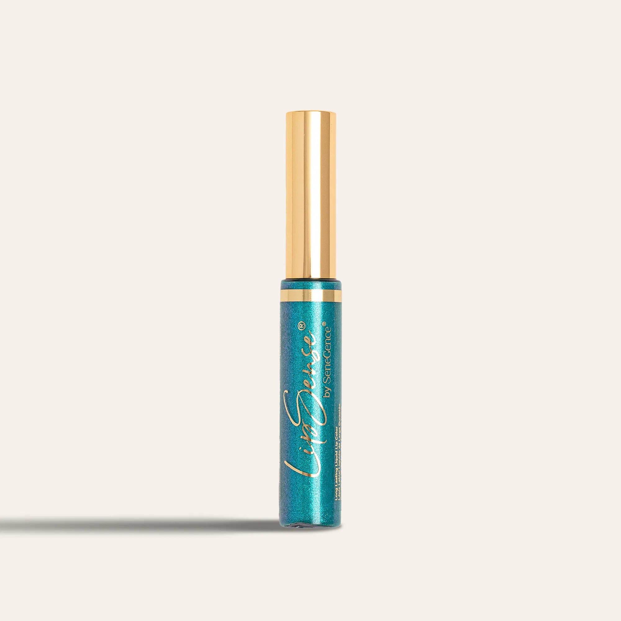
Correct your camera. Do not redesign the product.
Hold the tube beside the screen under the same light you shot in. If the frame is cooler or warmer than what you are looking at, fix that, then stop. Hue, saturation, pigment depth and skin tone are not yours to move. The moment you deepen a shade you have sold a shade that does not exist.
Show the views her decision needs. A labeled LipSense tube establishes identity, a swatch clarifies color, and a worn view shows how the shade reads beside a complexion. Not every post needs all of them, but every chosen view has to be true. Export in sRGB, the color space nearly every phone and browser assumes, so what leaves your camera roll resembles what she opens.
She is going to hold your photograph up against her own mouth in a mirror. Give her one that survives it.
how to use it
Compare the capture with the worn shade, side by side under the shoot light, before you touch a slider. Correct exposure and white balance only. No automatic filters, no beauty mode, no smoothing and no whitening — several phones turn those on by default, so check rather than assume. Name the exact product in the frame or in the caption.
the science
Color can shift at capture, beside the complexion, during export, and on the screen she is holding. You control the capture, the visual context, and the export profile. Exporting in sRGB keeps the viewer's screen from drifting further than it has to because that is the space most displays assume when a file carries no other instruction. Honest, decision-relevant views beat a compulsory set, and a screen rendering is never a color measurement.
No doctored before-and-afters
A pair of photographs is an argument you are making. It only holds if one thing changed between them.
So mark the floor. Mark where the light stands, where she sits, where the camera goes. Same lens, same distance, same angle, same expression, same hair pushed back the same way, same crop. Skin stays untouched: no smoothing, no reshaping, no sharpening one side and not the other.
Ask twice — once before you photograph her, once before you publish the pair. The second yes is the one that matters, because by then she has seen the picture.
If a real variable moved, say so or stop calling it a comparison. A MakeSense Foundation match shot under two different bulbs is a lighting demonstration, not a result.
how to use it
Get permission twice and write down which photo, which words and which channel it covers. Keep the originals untouched in case anyone asks. Note the product used, the date, and anything about the room that changed. If you cannot reproduce the first frame, you cannot publish the second one as a comparison. Shoot the pair again.
the science
A visual comparison is interpretable only when the capture variables are held. Focal length changes proportion, distance changes perspective, light changes texture and shadow depth, and expression changes which lines are visible at all. Any of those variables can produce a difference larger than the product did. Hold them, keep the raw files, record the conditions, and what is left in the frame is the difference worth showing.
Write Photo Captions With the Product, Visible Result, Context, and Next Step
A photograph makes a promise before she reads a word. Your caption keeps that promise honest and finishes it.
Name the exact product: ShadowSense. Say what is visibly different in the frame. Add the context that changes how she should read it — one coat, no filter, photographed at a window — and offer a useful next step when the photograph calls for one.
Leave my eyeshadow out of the caption.
Overlay, caption, and image have to make the same honest promise. When they disagree, the biggest element wins, and the biggest element is almost never the careful words.
Then write the alt text for the actual photograph: product, shade, finish, placement, and what is visible. It is how someone using a screen reader encounters the picture, and it is not a hiding place for a qualification the visible caption should have carried.
how to use it
Name the product, then say what the image actually shows. Add every condition that materially changes the reading, such as one coat, natural light, or no filter. Keep the point a client needs in the visible caption. Write alt text for the picture rather than for search — product, shade, finish, placement, and the visible detail that matters.
the science
Image, overlay, caption and alt text arrive together as a single interpretation. A phrase like filter-free is only true when smoothing, reshaping, selective contrast and color shifts are all absent as well. A customer's photograph is her experience, published with her yes and framed as hers. Alt text describes what is in the frame; used to carry a qualification the sighted reader never sees, it fails both audiences at once.
Repeat Light, Background, Crop, and True Color for a Recognizable Photo Style
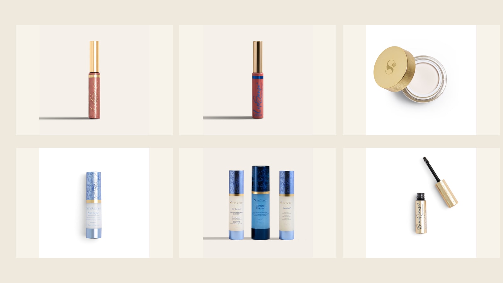
Your feed does not look considered because of the editing. It looks considered when the capture is consistent enough to recognize and responsive enough to show each subject truthfully.
Write down the controls that make frames comparable: light position, background, camera height, lens, exposure, white balance, and crop. Then choose the views the customer decision needs. A product hero, texture or applicator, shade reference, or real-use view earns a place when it helps; none is compulsory.
Let the material choose the angle. A glossy LipSense tube, a matte compact, and a translucent bottle each need a different relationship to the light before they read as themselves.
Then inspect the actual exports at feed and full-post size, in bright and dim viewing conditions.
how to use it
Keep the capture controls somewhere you can read them while shooting. Reshoot a shade comparison only when the light matches the original setup. Archive the original, the final, the setup notes, and her permission together; when the image is reused, the permission is the file you will need. Keep the examples reachable through the exact Hub routes and official exits: LipSense Long-Lasting Liquid Lip Color and its current official page, MakeSense Original Foundation and its current official page, and ShadowSense Eyeshadow and its current official page. Then build the photograph into a customer-centered post.